A few days ago, I did a post on DTUs of an Azure SQL Database. In the post, I mentioned a report that you can use to see how many DTUs your subscription has used. This is an important number to know and measure over time so you don’t get slapped with an unexpectedly high bill or have performance issues because you have exceeded your DTU limit.
Azure has quiet a bit of reporting that can me used to get the current state of your Azure subscription. Although many of the metrics are targeted more for subscription rather than database performance counters, there are few DB related such as Deadlocks. Below is a small list of the items that can be viewed, of course there are more than included in the list:
-
-
- Azure SQL Database
- Data space allocated
- Data space used
- Deadlocks
- In-Memory OTLP usage
- DTU used
- What is a DTU? Stands for Database Transaction Unit. Here is a nice article by Andy Mallon the does a nice job explaining what it is. Click Here
- Storage Accounts
- Used Capacity
- Egress
- Ingress
- Availability
- Azure SQL Database
-
How do I Get to the reporting tool?
Getting to the reporting tool is just a matter completing a few clicks. Of course with most products there are several ways to get to a specific place.
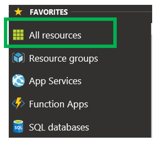
On the left side of the Azure Portal, click “All Resources”. You could also click on Resource Groups if you like.
Just a little side note on how to add a resource. As expected there are many resources in the Azure world. Here are just a few: Azure SQL Database, Azure VM, Storage accounts, resource groups, Cosmos DB as well as many other items. Not all resources are from Microsoft. There are a number of resources that are made available in Azure. After you click the “Add” button, you will be taken to a page that looks something similar to what is below.
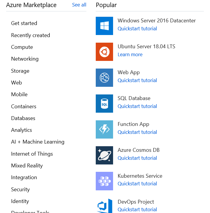
Above is a screenshot of some of the available resources. The list on the left is just the list of resource categories. On the right are some of the resources in the chosen category. You can either pick a category or click the “See All” link towards the top.
Once you click the “All Resources” link you will be taken to something that looks like this.
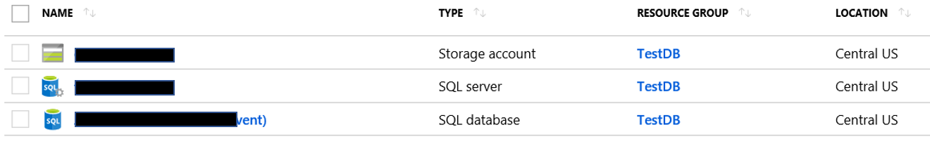
The above image lists a number of important items. Obviously the resource name is included and the Resource Group that resource is part of. You can also see the resource type and the Location. The location is really important, especially when it comes to cost. Since this blog post is about Metrics reporting, it is important to note that not all the resource types have this type of reporting. Above you will see that I have three resources, a storage account, a SQL Sever and an Azure SQL database. Of these three, the SQL Server is the only one that doesn’t have this metrics reporting functionality.
Once you click the resource you would like to get the reports for, you will be taken to a page similar to this.
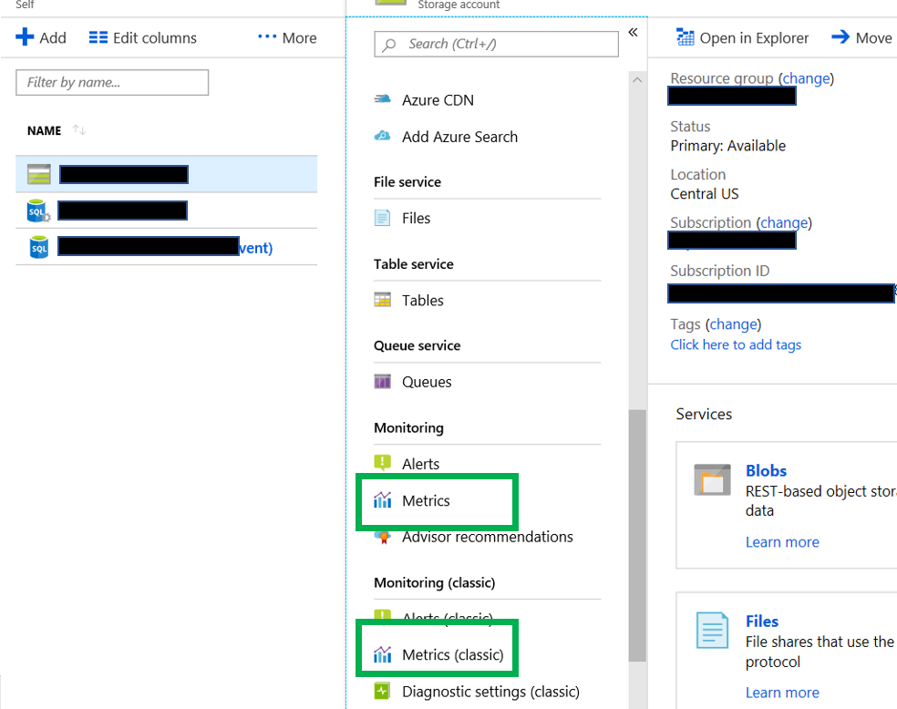
By chosing a resource on the left, the panel on the right will update with the information for that resource. In the above situation, I chose the storage account. Notice two green boxes, both of these will take you to a reporting tool. You want to click the one on the top. The bottom one, Metrics(Classic) is going to be retired on June 30, 2019. This is according to Microsoft.
Creating the Chart
Now you simple click on the Metrics link and you will be taken to a page that looks similar to what is below.
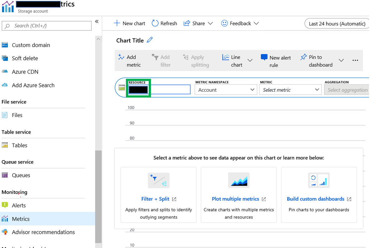
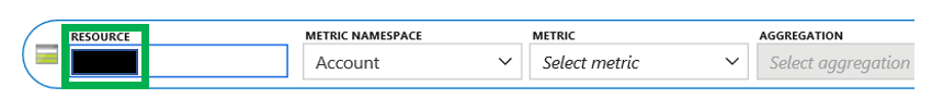
Now confirm that you are on the proper resource by viewing the resource identified in the box highlighted in the green box. If you are not on the proper resource, simply click the resource that is there and you will have the option to change to the proper resource.
Staying in the same box as the resource, you will see a few other items.
 Metric Namespace: This is the group of metrics that you are looking for. The items in the drop down box changes depending on the type of resource selected. Since I am working with a storage account, you see the account option. If you don’t see this for some reason, click the “Add Metric” link that can be found just under the Chart Tile.
Metric: This is the counter that we are looking to review.
Aggregation: This is what it says it is. There are usually three options, Avg, Min and Max. However, some only have Avg as the only choice.
Once you have chosen all the desired options, you will see this.
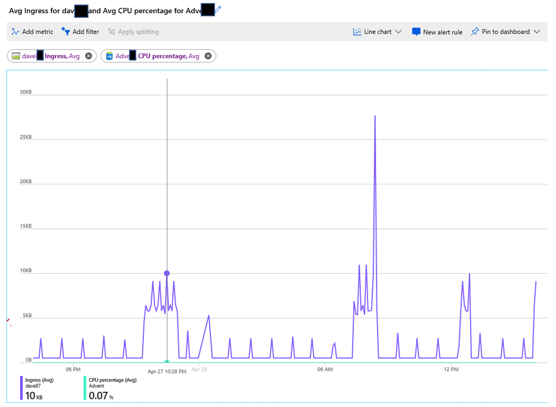
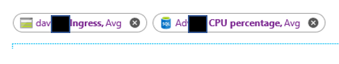
As you can see, this chart contains more than one metric. This is easy to add, just click the “Add Metric” link in the upper left hand corner. When you do, you will be given the same options as before. The additional metrics do not have to be from the same resource, as you can see. The metric on the left is from the storage account, while the one on the right is from the Azure SQL Database.
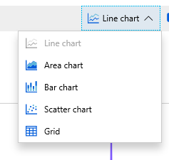
 Although this example is a line chart, you can change the chart type easily. Just click the arrow to the right of where it says “Line chart” in the upper right corner.
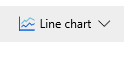 Just like in Excel, there are a number of options for chart types, just not as many options. Only 5 options here. Just like in any other reporting tool, not all charts work well with all data sets.
Also in the upper right corner you can change to time range of the chart.
![]() If you click the time, the options window for the chart will open up. As you can see there are a number of options, including the time range, the Time granularity(time interval) and the time(GMT or local time).
If you click the time, the options window for the chart will open up. As you can see there are a number of options, including the time range, the Time granularity(time interval) and the time(GMT or local time).
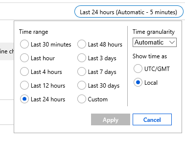
The options for Time granularity are in intervals that would be expected. The options are listed below.
-
-
- 1 minute
- 5 minute
- 15 minutes
- 30 minutes
- 1 hour
- 6 hours
- 12 hours
- 1 day
- 1 week
- 1 month
-
You also have another option, Automatic. The interval for automatic is dependent on the Time Range chosen. Below are the time ranges with the automatic interval.
-
-
- Last 30 min – 1 minute
- Last hour – 1 minute
- Last 4 hours – 1 minute
- Last 12 hours – 5 minutes
- Last 24 hours – 5 minutes
- Last 48 hours – 15 minutes
- Last 3 days – 15 minutes
- Last 7 days – 15 minutes
- Last 30 days – 30 minutes
-
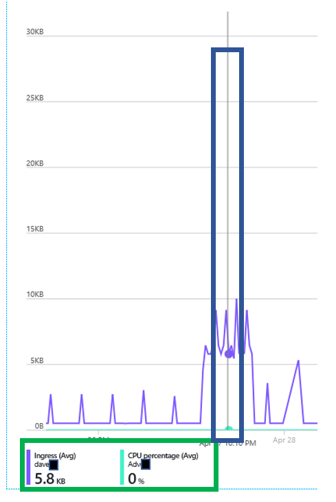
Another area that could be very helpful is in the lower left corner. There will be one number for each metric that has been added to the chart.
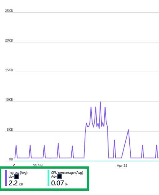
In the green box above there are a number of data points. It contains the resource name of the color of the line in the chart. It also contains the name of the metric, aggregation used as well at the value. In this case the number represents the aggregation listed for the data range of the chart. If you float your cursor over the chart and vertical line like below will appear. When you do this, you can move it to any time on the chart and the numbers in the lower left corner will no longer represent an aggregate, but the numbers of the point in time on the chart.
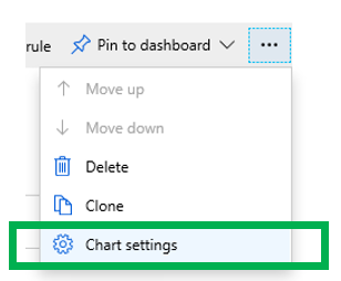
Now that I have created my chart, but the numbers on the Y axis don’t meet my needs. This can easily be changed. In the upper right hand corner you will see three dots. If you click it a menu opens up and you can the click “Chart settings”.
 Once you click the menu item, the settings window opens. Here you can change only Y value. Remember the X values are determined by the date range mentioned earlier.
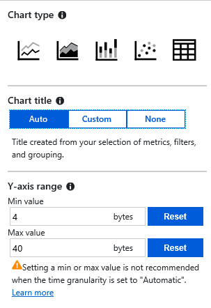
In addition to the Y value, you can also change the Chart Title and chart type. Notice that the unit of measure is bytes, but many of the metrics are in MB. If you change to a time granularity to something other than automatic, the warning goes away.
Notice the warning:
“Setting a min or max value is not recommended when the time granularity is set to Automatic”
Pin to Dashboard
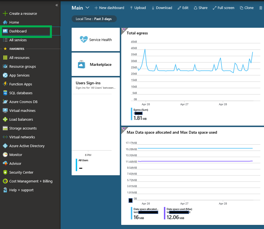
Once you are in the Azure portal, you can have one or more dashboards. Once you have your chart looking they way you want it to look, you can then pin it to your dashboard. Once you do that it, will now appear as below. In this case I have two charts pinned.
To pin your chart to the current dashboard, click the “Pin to dashboard” button in the upper right corner.
![]()
When you do, you will have an option to pin to current dashboard. However, when it is pinned, your dashboard may not look as you like it. If this is the case, you can click the “Edit” option on the dashboard.

Once in edit mode, you can move the charts as you see fit.
One nice feature of pinned charts is that the vertical line that appears when you float your cursor over the chart still works. There is one additional feature that is very nice if you have more than one chart.
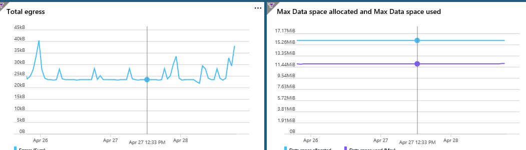
When you have more than one chart, the line appears on all charts that are pinned to your dashboard.
Hopefully this will help you with creating charts in the Azure portal. Thanks for stopping by my blog and I hope you learned something.