One for the first things that jumped out at me in Azure Data Studio was the “Explain” button. After you make your connection, you will see in the upper right hand corner of the query window the Explain button.
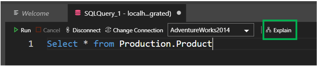
At first I was thinking maybe it is a short cut to help. Nope, it is actually an easy way to get the estimated execution plan. The key is estimated execution plan. While in SQL Server Management Studio we have been able to easily get both the estimated or actual execution plan.
Just as a reminder, the actual execution plan requires the query to actually run. While the estimated plan will use statistics to generate the plan. Generally, if the actual and estimated are capture very close to each other, you are more than likely not going to see a difference between the tow.
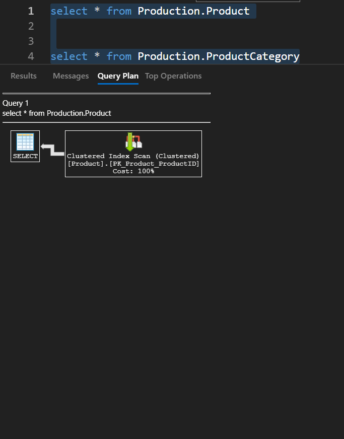
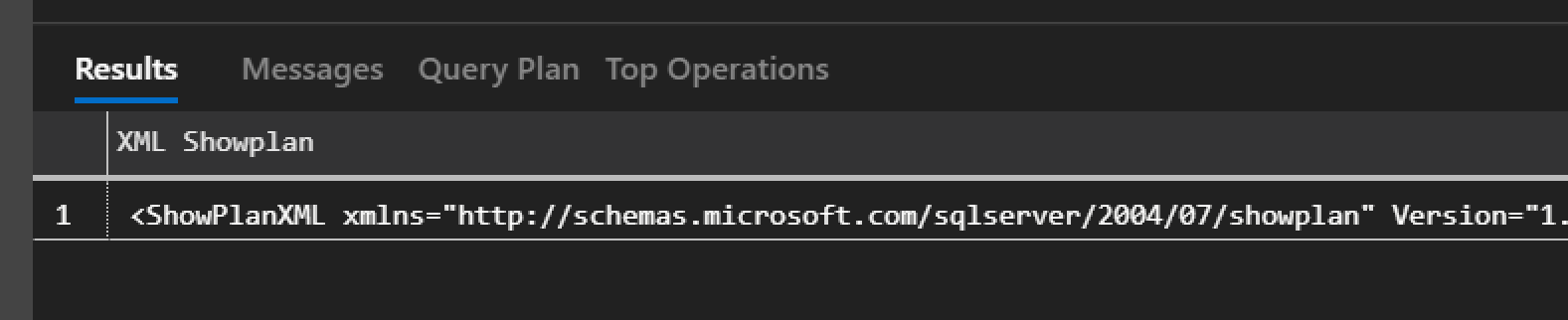
Now let’s talk about the Explain button. It will return two things, the XML of the execution plan and a graphical representation of the execution plan.
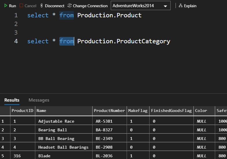
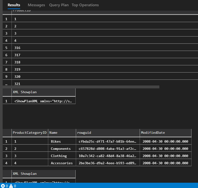
You will notice in the above image, the Results tab. Just as in SSMS, this is where you can find the results of the query. In the image above I simply clicked the Run button and the results were returned.
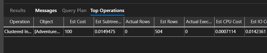
When you click the Explain button, the look of what is returned will be a bit different. You will still see the Results and Messages items, but there are now two additional items, Query Plan and Top Operators.
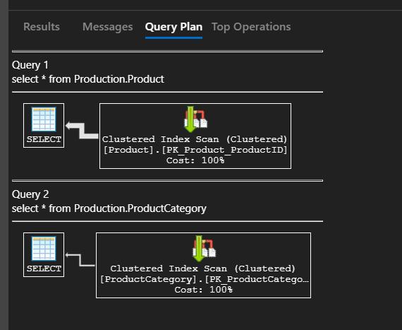
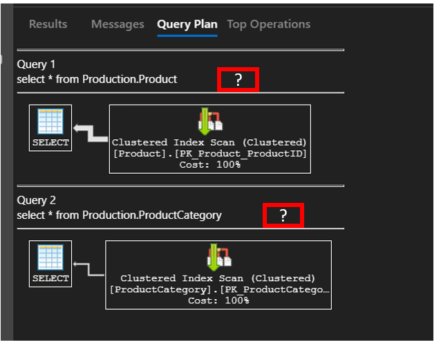
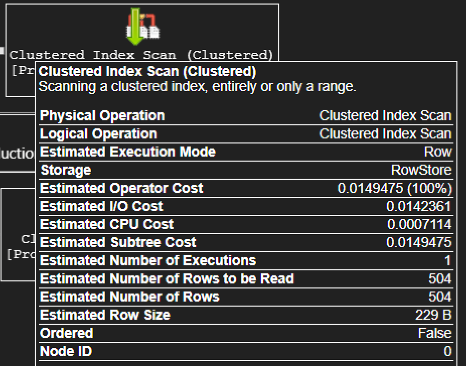
The query plan will be the item code that is selected, revealing the estimated execution plan. There are two ways to show that it is indeed the estimated plan. The first is that under the results tab you will not see the results of the query. Rather, you will see the XML of the plan, no data. Remember, SQL Server does not execute the query when returning the estimated execution plan.
Another area to look at to show that the plan is an estimated plan rather than actual is by looking at the properties of some of the operators. Notice in the image below there are a number of Estimated properties but no actual. If this was the Actual plan, you will see both estimated number of rows and actual number of rows.
Another feature that I like is the Top Operators item. This does exactly what you expect it to do, return the top operators. If you have used SentryOne Plan Explorer this is not new to you. But for the others who have not used Plan Explorer, this will be a welcome feature. And if you haven’t use the SentryOne Plan Explorer…..you SHOULD. It is a great tool and can be downloaded for free. To make is easy for you…here is a link to download it, Click Here.
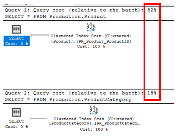
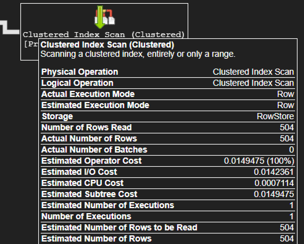
What if I want the Actual execution plan and not the estimated plan. There is not a button for this, but there is a short cut. Just hit ctrl + m. This will execute the query and return the actual plan. As you can see below, we have both Actual number of rows and estimated number of rows.
When running this I did find something interesting. If I have two queries such as below in SSMS and I capture the actual execution plan, I will see both plans.